How to create the perfect ecommerce product page (Part Two)
Last week in the Nosto blog I looked at some of the ways you can optimize your ecommerce product page- including high-res product images, distinguishable call to action buttons and detailed product descriptions. The goods news is that there is so much you can do that I’m back, in the second part of this series, with a whole load more tips…

Highlight variants
Product variants are, quite simply, the different versions of a product that you stock – this may include options such as size, color, material and even price. Many retailers will have items with a high number of variants and consumers are used to seeing these listed on a product page. However, variant options can interfere with your UX. This is because they often require a shopper to make extra product selections before adding an item to their cart. If it is not clear what selections a customer needs to make then the buying process can be disrupted and shoppers’ become frustrated.The best case scenario is a short and flustered clicking frenzy before they work out what to do, but the worst case scenario is that they give up altogether and go elsewhere.
To avoid this make sure the variants are clearly marked, then draw immediate attention to any section a user fails to complete. Red text, arrows, movement – use whatever tactics you want, subtlety should be abandoned here so that your product is not.
And one last thing – if you are listing a number of variations of the same product, try to provide photos for as many of those variants as possible, especially those that are particularly visual (i.e. color).
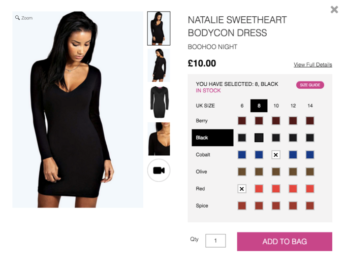
Retailer BooHoo does a great job of clearly showing all the variant options for their product as well as what is in stock. If you try to proceed without clicking an option the “Please select colour and size” text repeatedly flashes at you, making it clear what needs to be done to proceed. They also highlight the selected colour and size variant making it very clear which product you have selected.
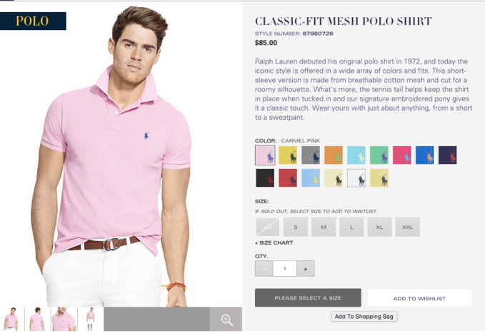
Ralph Lauren is another good example, changing the text on the call-to-action button to read “Please select a size” if a shopper hovers over it without making a selection. Simple UI tricks like this can make a big difference.
Provide an in-depth size guide
According to Econsultancy, retailers in the US report a return rate of between 20% and 40% for online sales, with poor fit cited as the number one reason’. Now, size may be of obvious importance for the fashion world but it can be similarly crucial in other verticals as well. For example, a bicycle’s frame dimensions is as important a detail for a cyclist as the dimensions of a shirt for other shoppers. The first thing to do then, is to figure out if this is a piece of information that will matter to your customers. The second thing, is to figure out how to best represent it…
The simplest way to specify dimensions is in product descriptions- clearly listing as much useful size information as you are able to. But depending on the product on offer there may be other more effective, or more interesting ways, of doing so. By far the most efficient way in fashion is to reveal how tall the model is and what size the model is wearing, as shown in the image below from the Caliroots website (if you like this blog, you can buy me that shirt, I’m size L).
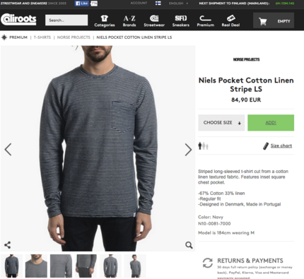
Caliroots tell you the exact measurement of the model and the size they are wearing.
Granted, size guides can be laborious to produce. I recently talked to a merchant in a fashion business who does their own sizing guide the hard way- measuring every single variant in-house as actual sizes can vary between brands and even within a brand’s own ranges. This is hard work, but it is also top service and can pay off as a reduced return rate. For a more scalable solution consider using technology such as Virtusize, which tells shoppers the exact dimensions of the clothes and allows them to compare the fit to previously purchased items.
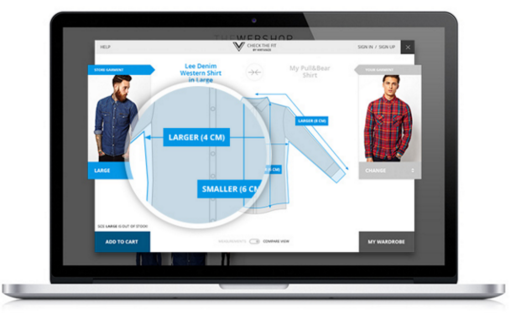
Virtusize gives exact information on the dimensions of clothing, as well as comparing new items to pieces already bought.
Of course, the options don’t stop there- the product page is what you make it, and really your imagination is the limit. Ikea for example, went one step further to demonstrate the size and fit of their products by offering an augmented reality option where you can virtually place an item into your room to see how it would look and fit.
Use cross and up-selling product recommendations
The product page is not only an opportunity for your potential shopper to buy something from your store but an opportunity for you, the retailer, to highlight more of your products and increase your chances of a larger average order value. According to Forrester Research analyst Sucharita Mulpuru, product recommendations are responsible for an average of 10-30% of ecommerce site revenue (an average we have also seen at Nosto), and your product pages are the perfect place to drive this.
But don’t think of recommendations only as a trick to drive greater basket size. Both alternative and supplementary products should be highlighted here to enable easier product discovery. Since a customer is typically still in search-mode while viewing product pages, alternatives for the viewed item should be prioritized. Research from Econsultancy has shown that upselling can drive up to 4% of sales, performing 20 times better than cross selling, something that we have also seen with our clients at Nosto.
This isn’t to say that supplementary products, normally utilized more on the cart page, have no place here. By offering both options you allow the shopper choice to explore, rather than forcing them down one avenue.
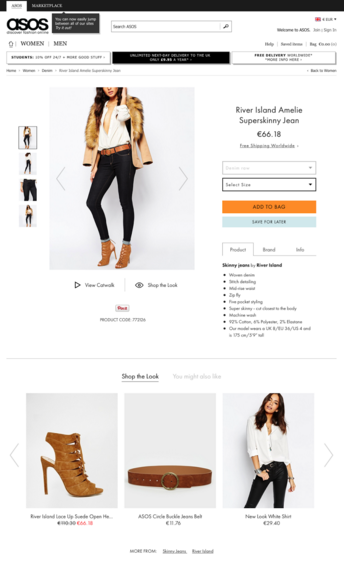
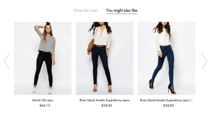
ASOS does an excellent job of this, upselling with alternatives but allowing customers to accessorize with a “shop the style” section available on a different tab.
Bonus: The role of cross-selling recommendations is not always to be clicked, so don’t be surprised if these have a lower CTR to alternative recommendations. The aim can sometimes be simply to be shown, exposing a shopper to more of the product inventory, or, as in the ASOS example above, helping a shopper imagine the product they are interested in as part of a complete picture, reinforcing their choice.
Provide two breadcrumb trails
A breadcrumb trail is a form of secondary navigation that shows a shopper where in the site map they currently sit. Breadcrumbs trails are nothing new, in fact for ecommerce sites with a substantial page hierarchy depth they are often included as a standard page element. A regular vertical breadcrumb allows you to jump upwards in hierarchical structure, for example back to the category page. However, a usability study by the Baymard institute found that ecommerce companies should be offering two types of breadcrumb trail; both hierarchy-based and history-based breadcrumbs. Yet, according to this same study ‘68% suffer from sub-par breadcrumb implementations: 45% have only one type of breadcrumb (typically hierarchy-based, lacking the history-based), and 23% don’t have breadcrumbs at all’.
A good product page should then feature a secondary breadcrumb that is tied to your personal browsing history. This takes into account the fact that the user may have not taken a linear path through the site, or that, if they did come from the category page they may have applied a number of filters (in this case ‘return to results’ will allow a smoother UX). By combining a vertical breadcrumb with this browsing history breadcrumb (referred to by Baymard as a ‘horizontal’ breadcrumb), you allow a shopper to choose how they wish to explore your site, making it easier for them to do so.
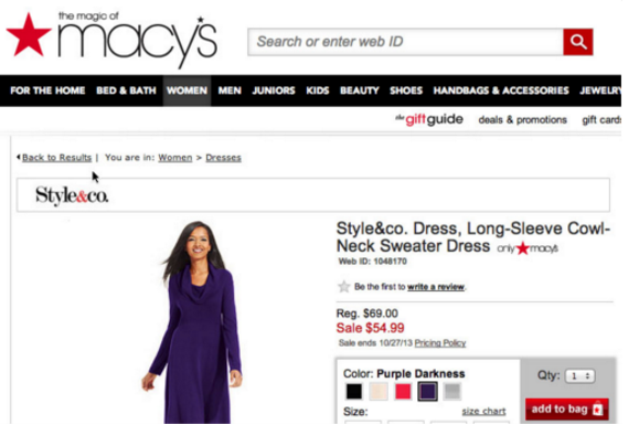
This example by Macy’s, as highlighted in Baymard’s study, uses both a vertical breadcrumb (“You are in: Women > dresses”) and a “horizontal” breadcrumb (“Back to Results”).
Use product availability to your advantage
Stating that a product is available and ready to ship (even specifying when you will receive it if it is ordered now) is a good way to increase the conversion rate on your product page. It is all about removing barriers to purchase. For example, if you are buying a gift for a friend’s birthday and you aren’t sure that it will arrive on time then you are unlikely to buy the product at all. By telling someone that they are able to buy it and even when they will receive it you make it much easier for them to imagine themselves doing so.
Sometimes introducing a possible availability-driven barrier to purchase can actually motivate a shopper. For example, many ecommerce merchants now actively quantify and show stock availability when items are low, creating a sense of urgency and encouraging customers to make the purchase there and then. And if you don’t want to wait for your product stock to run out consider time-bound free shipping instead.
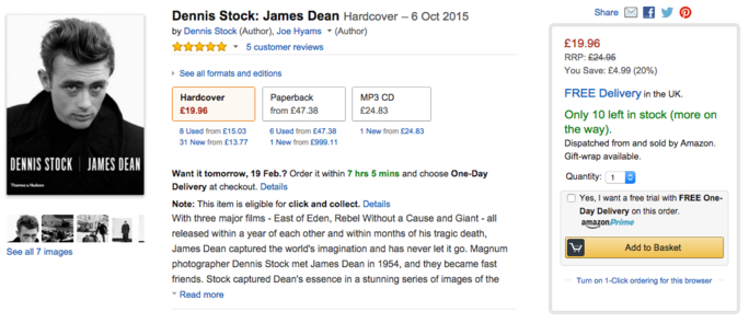
Amazon are one example of a company that uses scarcity on product pages to drive sales, quantifying those items that are low in stock.
Offer live chat support
As we have consistently illustrated, one of the things that is key to your product page is conveying as much information as possible. That said, you are only human, and even with technology at your fingertips, it is highly unlikely that you are going to be able to preempt every possible question a customer may have. But should a customer have one of these questions, what option are you going to leave them? Walk away without purchase? Waits days for an email response (while looking elsewhere)? Of course not. To address this problem as quickly and easily as possible consider enabling instant chat support on your product pages – this allows instant answers to your customers’ questions, enabling a smooth path to the cart page. In fact, 31% of online shoppers from both the US and UK say they are more likely to make a purchase after a live chat.
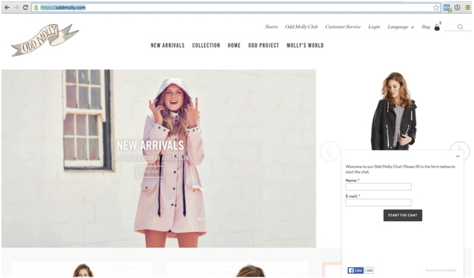 OddMolly have live chat enabled across their site to allow customers to get quick answers to any queries, as well as acting as data capture.
Still not convinced? See our guest blog from the Chat Shop on some of the benefits of this feature. Remember however, that there are a number of best practices you should take into account if you want this to be a help rather than a hindrance. A chat support which is on-duty only during office hours doesn’t really help if most customers shop during the evening hours. KissMetrics has a great blog that provides some guidelines, read it here. Some merchants use WhatsApp successfully too, but the tool you use really doesn’t matter – the experience you provide does.
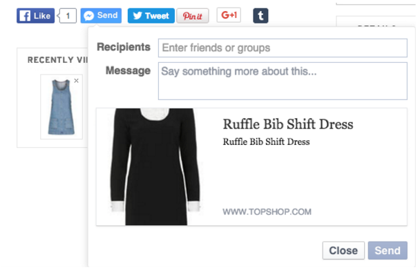
Enable sharing capabilities
The ability of your shoppers to share from your product page, while not immediately focused on conversion, should be considered as a feature that goes above and beyond, taking your shoppers from customers to promoters.
Allow customers to send the item they are viewing to other shoppers as a way of enabling user generated recommendations. TopShop, as seen in the image below, allow a shopper to share directly with another person by using Facebook messenger.
Social sharing, which can also be seen here, is also useful as a way to amplify your company’s voice and get extra exposure for your products. Be careful however; a case study by VWO showed that when hardware company Taloon removed their social sharing buttons they saw a 11.9% increase in CTA clickthroughs. This may be attributed to the fact that on most pages the number of shares and likes was 0 which then acted more as a social deterrent. The lesson? Only implement if your products are the type that encourage social sharing and your customers the type to partake in it! Teenagers are more likely to ‘like’ and share a top that they like than an older audience are likely to share a hammer they need for practical reasons (as was the downfall for Taloon).
I would recommend testing with all of these options as what works best for you will depends on your company. Remember, the aim of this page is still, and should always be, to get the item to be added to the cart- only you will know if too many bells and whistles in terms of sharing options are likely to distract your audience or enable them. GHD for example have a “send a hint” feature that allows shoppers to email a product to someone else as a not-so-subtle way of letting them know they want it, which also helps GHD collect valuable email-addresses.
For some companies this may be a distraction from the desired CTA, but GHD is a company whose products are often used by teenage girls, who are unlikely to be able to afford the fairly hefty price tag. This means that is it likely that allowing them to share the product as a gift suggestion is going to encourage a purchase rather than distract from one. The answer? Test, test, test! If you don’t know where to start, Nosto’s partner Shopify has a great blog focusing on different product page test methods and tools.
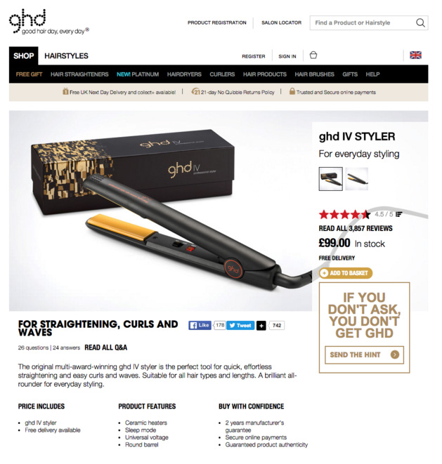 GHD have taking sharing to another level by allow users to
ask others to buy the item for the by sending a “hint”.
And there we have it, a number of ways to optimize your product page and the conclusion to this mini-blog series. I hope you these tips and tricks will serve you well and please let me know of any good practices you would like to share in the comments! I would love to hear from you.
Want more ways to improve your store? Download “An Introduction To Personalization” below…