Beyond the Basics: Advanced A/B Testing Strategies for Ecommerce Growth
A/B testing has long been a staple of ecommerce optimization, but many brands limit themselves to the usual run-of-the-mill tests: button colors, homepage banners, or PDP image swaps. While these tests can increase revenue, they’re only the tip of the iceberg. Brands often miss out on deeper, more strategic experimentations for their online store. By testing elements like product discovery, pricing visibility, and personalization logic, brands can unlock insights that drive sustainable growth.
In this guide, we’ve gathered expertise from: Columbus, a digital consultancy agency; Avex, a Shopify agency; and Heatmaps, a heatmapping tool (alongside our own commerce experience experts) to explore high-impact A/B testing strategies that go above and beyond.
High-Impact A/B Tests That Drive Growth
As ecommerce personalization experts, Nosto has always offered our clients the ability to run A/B tests across their Nosto campaigns. But more recently, we’ve expanded on these testing capabilities to offer more advanced, full-site A/B testing.
Here, we highlight 5 popular, high-impact test ideas that we’re seeing our clients run successfully.
- PDP Layout Testing and Shopify Theme Optimization
Small changes in the product detail page (PDP) design can make a big impact on conversions. Test different layouts to see what drives engagement, like refining image galleries or enhancing trust signals.
Image gallery improvements: Instead of relying on small dots to indicate additional images (which many shoppers overlook, especially on mobile), test adding thumbnails for secondary images.
Interactive image pop-ups: Allow users to click on the main image to open a full-screen gallery where they can browse all product visuals and zoom in for a closer look.
Alternative gallery layouts: Experiment with different formats, such as side-scrolling carousels or stacked images, to determine what keeps shoppers engaged.
- Offer & Price Testing
The way pricing is displayed can significantly influence purchase decisions. Test different approaches to make installment plans more visible and appealing.
Instead of a small message about payment plans, try testing showing both the full price and the first installment side by side, in equal font sizes. This approach has proven especially effective for higher-priced products, making affordability clearer without downplaying total cost.
- Merchandising & Search Testing
Ensure shoppers always find the most relevant products by optimizing search rankings and merchandising strategies.
Test product ranking performance by prioritizing products based on real-time shopper behavior and intent or business KPIs like stock inventory.
Experiment with different filtering and sorting options to see what leads to better product discovery and conversions. O’Neill, a leading sportswear fashion brand, implemented an A/B testing strategy across multiple regions, comparing two search merchandising rules. This enabled them to increase conversions by 43% for their UK store, 21% for their German and Netherlands stores, and 15% for their French store.
- Cart Layout and Messaging Enhancements
The cart page is a key conversion moment—optimize it to reduce abandonment and build trust.
Test layouts that highlight trust signals, such as secure payment badges, flexible return policies, and customer reviews.
You can even test placing product recommendations on the checkout and thank you pages to see if these improve average order value.
- Segmented Tests
Not all shoppers behave the same way—so why test with a one-size-fits-all approach?
Run A/B tests on collection sorting for different customer segments to identify the most effective merchandising strategy for each group.
Personalize all areas of your site based on user behavior, preferences, and past interactions while pushing the most successful strategy.
Structuring Pages for Maximum Usability and Conversion
We spoke to Columbus, the experts in ecommerce UX and CRO, who shared a number of insights into specific pages of an ecommerce store, including the common problems they encounter, the solutions they recommend, and the key insights behind their approach.
1. Optimizing Product Page Information Architecture
Problem: Customers struggle to find essential product information buried within lengthy descriptions.
Solution: Restructure product pages by segmenting information into clear, concise sections, addressing common customer questions (size, material, delivery). Apply principles of simplicity and visual fluency to improve readability.
Insight: Users scan, not read. Make information easily accessible to enhance the purchase journey.
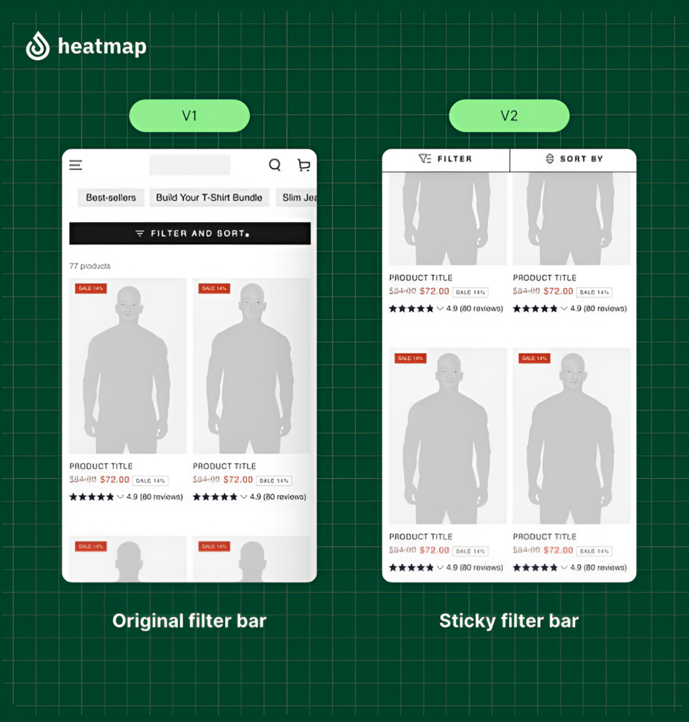
2. Enhancing Product Listing Page (PLP) Filters
Problem: Static filters positioned at the top of the PLP cause friction; users must scroll back to adjust them.
Solution: Implement sticky filters that remain visible as users scroll. This enhances cognitive ease and improves the user experience.
Insight: Convenience is paramount. Ensure filters are readily available to facilitate product discovery. Also, the impact of sales periods on stock availability and filter usefulness should be considered.
3. Streamlining Navigation Menus
Problem: Overly complex mega menus lead to choice paralysis and user confusion.
Solution: Declutter navigation menus using precise categorization, images, and concise text. Apply the paradox of choice to simplify options.
Insight: Reducing cognitive overload improves user navigation and increases conversion rates.
4. Simplifying Multi-Item Purchase Processes:
Problem: Requiring users to add each item in a set individually creates a cumbersome checkout process.
Solution: Implement a single “Add to bag” button for the entire set, clearly indicating the selected items.
Insight: Streamlining complex processes reduces friction and improves completion rates.
5. Increasing Discount Code Visibility:
Problem: Hidden discount codes lead to customer frustration and abandoned carts.
Solution: Prominently display discount codes on the basket page using a clear visual hierarchy.
Insight: Leverage loss aversion by making discounts easily accessible, minimizing customer effort.
6. Highlighting Key Purchase Benefits:
Problem: High drop-off rates on the product detail page to the basket.
Solution: Redesign the CTA area to highlight key benefits that address customer concerns and reduce the visual hierarchy of secondary CTAs.
Insight: Align page elements with the primary objective and address user concerns to improve conversion.
Using Behavioral Insights to Drive High-Impact Experimentation
Next, we spoke to the Shopify agency, Avex, who shared successful A/B tests they’ve run with Vitality, with the metrics to back it up, to demonstrate the power of data-driven decision-making.
- Mobile Navigation Optimization for Vitality
For Vitality, a fast-growing activewear brand, mobile heatmap data from Heatmap.com revealed that users were overwhelmingly engaging with “Tops” and “Bottoms” in the navigation, while links like “New” and “Shop by Color” were not clicked as much. Even more telling, those high-performing links had stronger click-attributed revenue and engagement. Instead of guessing what to promote, we tested a revised mobile nav structure that moved these links to the top.
The result: a +5.58% increase in purchases and a +3.32% lift in revenue, driven by simplified, user-led navigation.
- Hiding the Dynamic Checkout
In another experiment with Vitality, heatmap analysis revealed an unexpected behavior: despite its prominent placement above the fold on product detail pages, Shopify’s dynamic checkout button was consistently overlooked. Scroll depth and click data showed that users were bypassing it in favor of the standard “Add to cart” button. Supporting data from Shopify confirmed that dynamic checkout wasn’t commonly used until much later in the purchase funnel.
This led us to hypothesize that the additional checkout option was introducing unnecessary decision-making at a critical moment. By removing the dynamic checkout and simplifying the call-to-action hierarchy, we saw a +5.81% increase in purchases and a +5.56% lift in revenue.
How Heatmaps Elevate Your A/B Testing Strategy
To round out our insights, we asked heatmap.com to explain how their heatmapping technology can enhance A/B testing by uncovering user behavior patterns that traditional testing might miss.
Beyond pass/fail: Uncovering user behavior patterns
Heatmaps visually represent how users interact with your site, revealing insights beyond conversion rates. When combined with A/B test variants, they provide deeper context for results:
- Scroll depth analysis: Ensures key elements are within users’ viewable areas.
- Click heatmaps: Identify if users are attempting to interact with non-clickable elements.
- Attention heatmaps: Show which content sections engage users and which are ignored.
Real world success: data-driven optimization in action
A leading apparel brand partnered with That Works Agency and heatmap to resolve UX challenges on their ecommerce site. Heatmap’s revenue tracking uncovered that shoppers engaging with product filters spent 3x more, but session recordings revealed these high-value customers struggled to find and use them.
- Heatmap pinpointed friction: filter visibility was poor.
- Session recordings confirmed users abandoning due to navigation issues.
- Ran an A/B test: made the filter sticky and larger for better visibility.
Results: 13.07% lift in revenue per session, 4.22% increase in conversion rate.
This case demonstrates how optimizing seemingly minor interactive elements can significantly impact bottom-line revenue. Without the visual insights from heatmap, this opportunity would have remained hidden in traditional platforms.
Integrating heatmaps for continuous improvement
The best A/B testing strategies leverage heatmaps both before testing (to find optimization opportunities) and after (to analyze user behavior).
This creates a virtuous cycle of continuous improvement:
- Use heatmaps to identify friction points and optimization opportunities
- Develop A/B test hypotheses and design test variants
- Test, analyze results, and refine with behavioral insights.
- Apply heatmap analysis to understand user behavior within winning variants
- Refine further and repeat
By combining quantitative testing data with qualitative heatmap insights, you move beyond simple winner/loser dynamics to gain a deeper understanding of your customers’ behavior, creating frictionless, high-converting experiences.
Key Takeaway:
Advanced A/B testing is about understanding customers’ needs and behaviors through data-driven insights. Moving beyond surface-level optimizations, you can create genuinely impactful experiences that drive conversions and build customer loyalty.
Contributors:
At Avex, we partner with industry-leading brands to design, build, and optimize unified commerce experiences that fuel meaningful growth and long-term customer retention. By combining qualitative behavior analysis with quantitative data, we craft and test experiences that actually move the needle.
Curious what that could look like for your brand? Let’s talk.
Columbus Global Optimization, a team of experts in customer experience (CX) and conversion rate optimisation (CRO). We are passionate about data-driven decision-making and committed to enhancing user experiences and delivering measurable results that drive business growth.
Heatmap is the only on-site analytics platform that ties revenue to every pixel on every page of your website. Finally, you can optimize for buyer behavior instead of site traffic.