Using the Nosto brand
Everything you need to use our branding correctly
Brand colors
Our main brand colors are dark brown and white. Pink is not a background color, it is our main
highlight (or accent) color. Green is not a font color, it’s only for highlighting and backgrounds.
For example, if you want to draw attention to a specific word like “How to personalize your online store”
you can put it in pink but not green. If a black/white background doesn’t complement an image or text,
use a green background to ensure everything stands out visually.
# 211C1F
R 33 G 28 B 31
C 70 M 70 Y 72 K 75
# FF66BF
R 255 G 102 B 191
C 2 M 73 Y 0 K 0
# 0F5257
R 15 G 82 B 87
C 98 M 49 Y 56 K 31
# EDE3E9
R 237 G 227 B 233
C 4 M 10 Y 3 K 0
# 61575C
R 97 G 87 B 92
C 60 M 60 Y 51 K 27
R 237 G 238 B 239
# EBEDEE
*Only for web use
# FFFFFF
R 255 G 255 B 255
C 0 M 0 Y 0 K 0
Primary logos
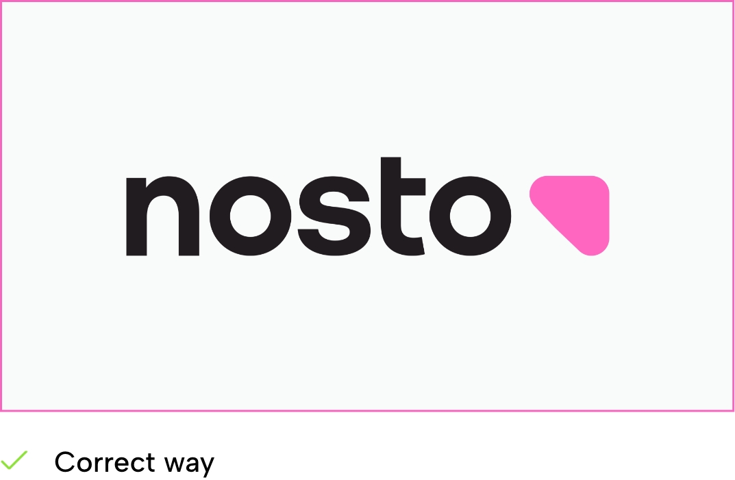
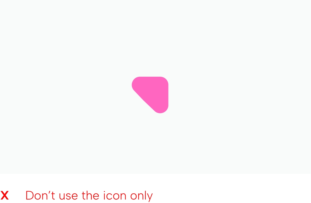
Our logo consists of our wordmark and our icon. Wherever possible, we should use the primary
logo with the text in black and the arrow in pink.

Primary logo
This is the default logo. It should be used in this form whenever possible.

Inverted primary logo
This version features a white wordmark for greater legibility on dark or busy backgrounds.
Monotone logos
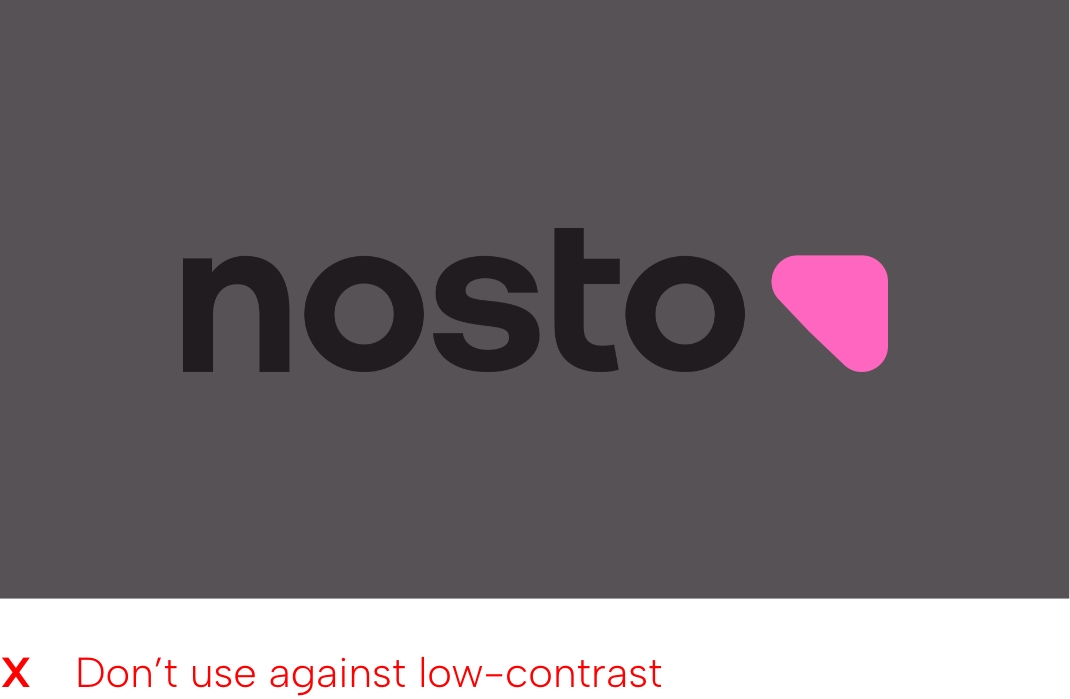
In instances where it’s not possible to use our full-color logos, use the monotone logo that provides the most contrast.
Below are examples of when this might be necessary:
- When budgets require single-color printing
- When exact color representations aren’t possible
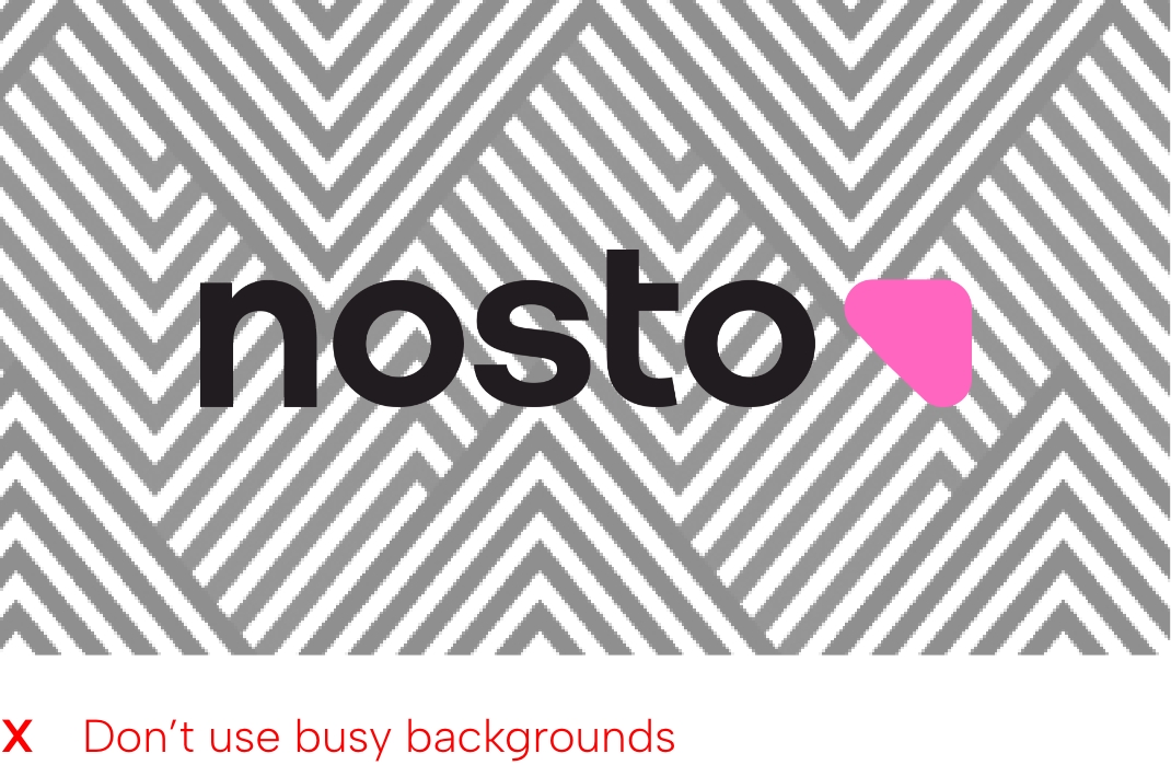
- Busy or patterned backgrounds
- Backgrounds without enough contrast

Monotone black
Use a monotone black logo if the background is particularly bright/light to ensure the logo stands out visually.

Monotone white
Use a monotone white logo if the background is particularly dark to ensure the logo stands out visually.
Clear space
Our logo looks best when it’s spaced correctly. Try to reduce the size of our logo instead of sacrificing spacing.
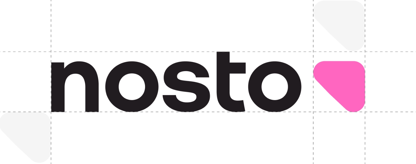
Always aim to have a clear space equal to the size of our arrow icon. This maintains its visual impact in every composition.
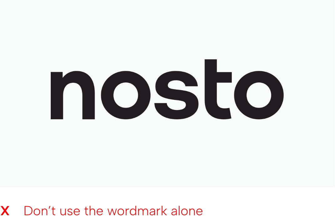
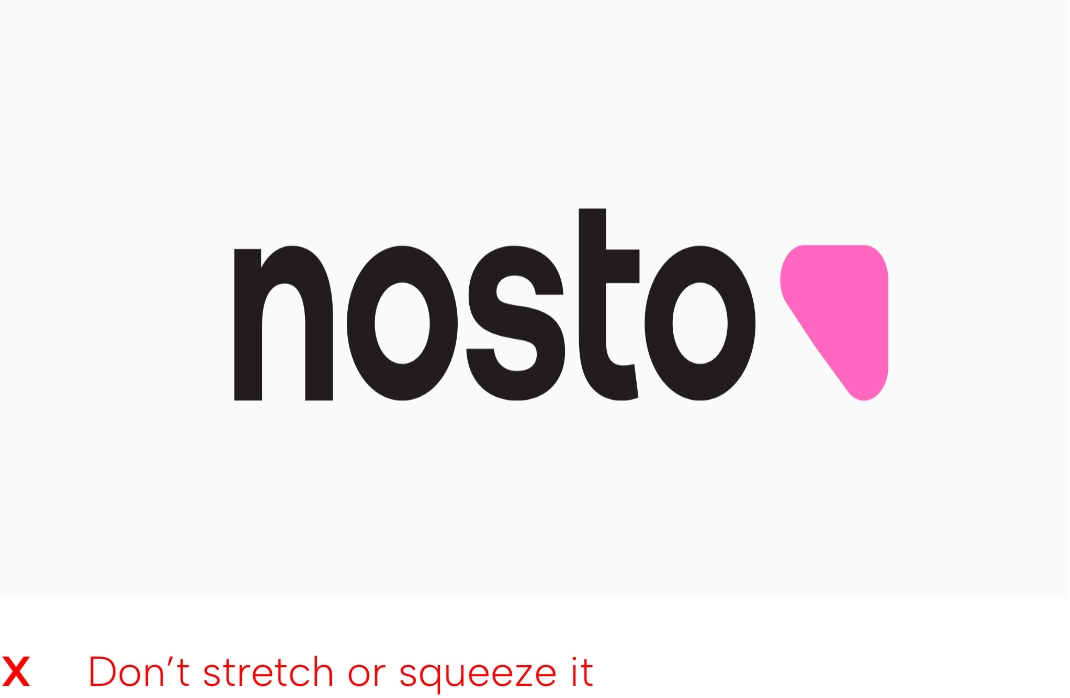
What not to do
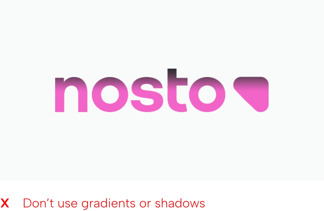
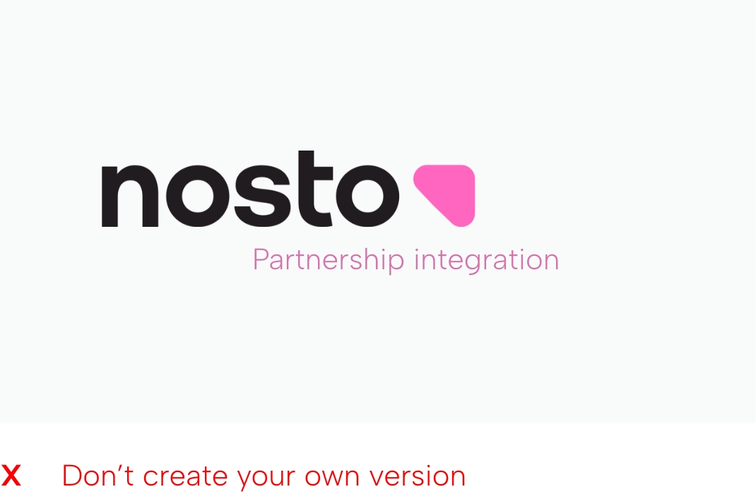
Here are a few examples of how you should not use our logo
