Optimizing Your Store: One Page vs. Multi-page Checkouts
In the world of ecommerce, cart abandonment is the buzzkill in an otherwise flawless shopping journey. In this post, our friends at Bold Commerce explore how online brands should optimize the most crucial page on their site to reduce cart abandonment.
There’s one page on your ecommerce store that’s key to driving conversions. It’s the last thing people see on your site, and it’s exactly where abandoned carts happen the most: 70% of the time to be exact…
Yup, you guessed it- it’s the checkout page.
There are a ton of tricks to help reduce abandoned cart rates – personalized triggered emails, strategically timed popups, and enabling free shipping options. But let’s get right down to the root of the problem: Is your checkout page optimized for your store?
While there’s no hard and fast rule about what works best for all sites, we’ve had our fair share of experience with both one page and multi-page checkouts.
There are pros and cons to both, so which one should you choose?
The short answer is: it depends on your store. Let’s weigh the options.
One Page Checkouts
A long and complicated checkout process is one of the main reasons customers will throw in the towel and leave before completing a purchase. With the ability to order just about anything with only a few clicks, people are expecting faster results more than ever.
Luckily, one page checkouts are your saving grace for a quick and easy checkout experience.
First, we’ll check out the pros of the one page checkout style.
1. Speed & convenience
If you’ve filled out your fair share of forms online, you understand how frustrating and long the process can be with multiple pages to deal with.
Even if you’re asking for the same information as multi-page checkouts, the shorter appearance of the one page checkout can work wonders on your conversion rate.
There’s no question keeping everything on one page is a lot faster. In fact, one page checkouts can slice that checkout time down by almost a minute!
With everything gathered together, users don’t have to worry about loading times when switching between multiple pages and can easily see any errors should they arise.
2. Ease of use
Shoppers can fly through the required information they need to input when it’s all gathered together in one spot. With limited space available you’re only asking for the required information, which ensures you’re not overcrowding the page.
As a bonus, if people find the process hassle-free they’re more likely to come back, becoming valuable repeat purchasers!
3. Clear navigation
Customers can easily see how far along they are in the check out process, without switching back and forth between pages, making the checkout journey much more straightforward.
Abandoned carts are less likely to happen if shoppers have already completed a majority of the required forms, or can see there’s only a few simple steps to complete before the product is all theirs.
4. Fewer clicks
According to research, the less clicks a customer has to make, the higher the rate of conversion for sales. Which makes sense – the less work required, the quicker the reward!
That’s why a one click upsell works great! If you want to add on some additional revenue while offering your customers relevant products they’d be interested in, consider using an upsell after checkout.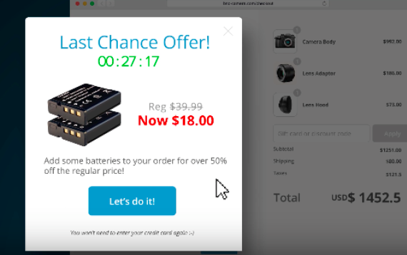
Customers don’t need to enter their details again to add the additional item to their cart, they simply click on the upsell popup and it’s added to their order! It elevates the checkout experience while leveraging the speed and convenience of the one page checkout we mentioned earlier.
Sounds good, right? Well, there are some drawbacks to one page checkouts as well, and it’s up to you to decide if they outweigh the positives for you store…
1. Can be overwhelming
If the design isn’t done right, the checkout page can appear really cluttered. And cluttered checkouts don’t typically convert well. At all.
The point of having a one page checkout is to reduce the time and amount of steps required to complete a purchase. But, if your customers have to scroll forever or search for an area they’d like to fill out first, it defeats the purpose.
2. Lack of product confirmation
Some shoppers like to look back at their order to ensure they have everything they want, and in the correct sizes, colors, etc. Depending on how careful they are, they could always re-read the information they’d just entered but with the normal one page checkout, they can’t review that info on a confirmation page.
Unless… you use Cashier! If you do, customers can confirm products right on the checkout page to make sure they’ve got everything they want, and in the correct variables. Whether you choose to use a one page or a three page checkout, we’ve got your back!
3. Limited statistics
It’s a great idea to use Google Analytics on all pages of your website to see how well things are going, and to recognize opportunities for improvement.
Typically, if a shopper does happen to abandon cart, it’s difficult to narrow down exactly what form field or part of the checkout is not converting well since everything is on a single page.
And if you don’t know exactly what’s driving consumers away, you definitely won’t know how to fix the problem…
The Solution? Bold’s Cashier app
With the Cashier app, you can have a one page checkout with the same insights normally seen on a three page checkout. Meaning, you can capture exactly when users abandon their cart
All in all, one page checkouts work best for stores with less complicated products without a ton of add-on or customization options.
It’s hard to squeeze the extras onto one page while still making it easy on the eyes.
Plus, if your target audience consists of impulse buyers, one page checkouts are in your favor as customers are less likely to pull away, get distracted and visit another website to compare prices.
Multiple Page Checkouts
Multi-page checkouts are pretty standard and have been around in the ecommerce space forever- and for good reason. Well, a few good reasons:
1. Clear analytics
With multi-page checkouts, it’s easy to see where the drop off point is for abandoned carts.
Because different points of the checkout process are on different pages, you can see exactly which page users are bailing on. You can then use that opportunity to optimize the page!
2. Email collection
One of the best things about the multi-page checkout style is that a user will normally enter their email address on the first page.
Why is this important? Even if they decide to abandon their cart at a later time, you’ll still have their email address as a means of contacting them again.
As I mentioned in the beginning of the post, a great tactic to win customers back is to send abandoned cart emails, showing off the goodies they were interested in purchasing. It just might change their mind and make come back to complete the purchase.
3. Manageable Content
For some people, spreading the forms across several pages is the preferred style of checkout. By separating content into chunks, customers get a little break before the next page loads, especially if you need to gather more than the basic required information.
4. Clean layout
Since information is spread across multiple pages, it’s much easier to ensure a clean design.
It’s visually more appealing than some one page checkouts which may try to cram too much in a small space.
Generally, the multi-page checkout is a much more clear option in terms of usability and design. But, that’s if it’s done right!
So, why isn’t everyone using the multi-page checkout? Well, there’s some obvious drawbacks that lead to frustration for many customers.
1. Length of checkout
Landing on a site only to find several long pages full of fields is daunting to say the least, and can cause even the most serious shoppers to flee.
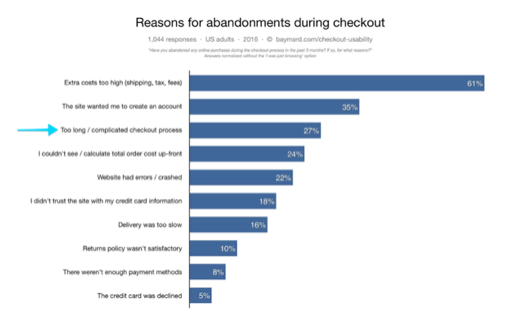
In fact, research shows that users are overwhelmed just at the sight at a large amount of form fields.
Many people don’t want to take the time to navigate through a long and complicated checkout, especially when technology has advanced to a speedy, faster-is-better mentality.
If the checkout is taking too long, shoppers may get distracted, bored or frustrated and give up.
If you do choose to use multiple pages, consider including a progress bar at the top of each page. That way, customers can see exactly where they are in the checkout process.
2. Complexity of checkout
In general, the more pages involved in a checkout, the greater the chance of cart abandonment.
One out of four consumers are abandoning cart due to a long, complicated checkout process. Or in other words, 25% of your customers. That’s definitely not a number you want to ignore!
3. Loading time
Every step a user has to take to get to the that “Complete Purchase” button is just another chance for things to go south.
Switching from page to page may not seem that tedious, but it heavily affects your conversion rate. And with only 1% of conversions adding up to thousands of dollars, you’re missing out on some serious revenue!
Loading times may be unavoidable though. If you offer customizations on your products, require additional information from your customers or any other options that would take up major real estate on the check out page, multiple page checkouts might be your best bet.
The Best of Both Worlds
Luckily, with Bold’s Cashier app you have the choice of one page or multi-page checkout.
Cashier is a global checkout experience that scales with your online business. It’s fully customizable and feature-rich, ensuring your customers are getting the best experience possible.
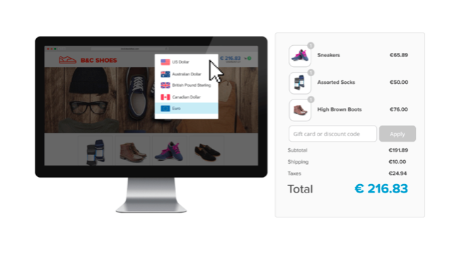
Some handy tools to make the experience smoother include allowing international customers to shop and pay in their own currency, multiple language support, price rounding, payment capture on shipment and many more.
Every store will have different needs, and those may change with time or as your store grows. With Cashier, you have the freedom and flexibility to change checkout styles at any time.
No matter what checkout you choose, remember that the main goal is to make it as easy as possible for your customers to complete the checkout process!
Abandoned carts are bound to happen for a number of reasons, but one of the best ways to prevent them are to optimize your checkout page for your store.
About the Author
Amy is the Partner Marketing Manager at Bold Commerce.
Bold isn’t just another eCommerce solutions provider. We are a team of 200 professionals who live and breathe eCommerce. We empower over 100,000 active customers and are trusted by global brands like Zippo, Microsoft, Google, NFL, NBA, and Procter & Gamble to help take their online businesses to the next level.