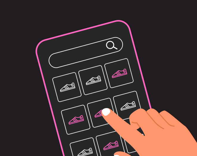
January 18, 2024 4 Minute Read Nosto and Tapcart launch new integration, helping Shopify brands boost mobile sales with personalized shopping experiences Read more
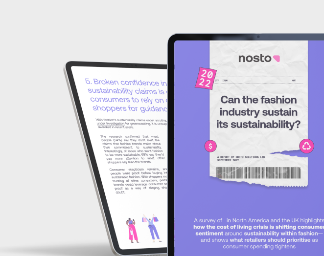
September 22, 2022 6 Minute Read New Research: 61% of Fashion Shoppers Put Price Above Sustainability as Living Costs Rise Read more
March 26, 2024 2 Minute Read Introducing the Nosto Customer Community: Elevating our Clients’ Experience with us Read more
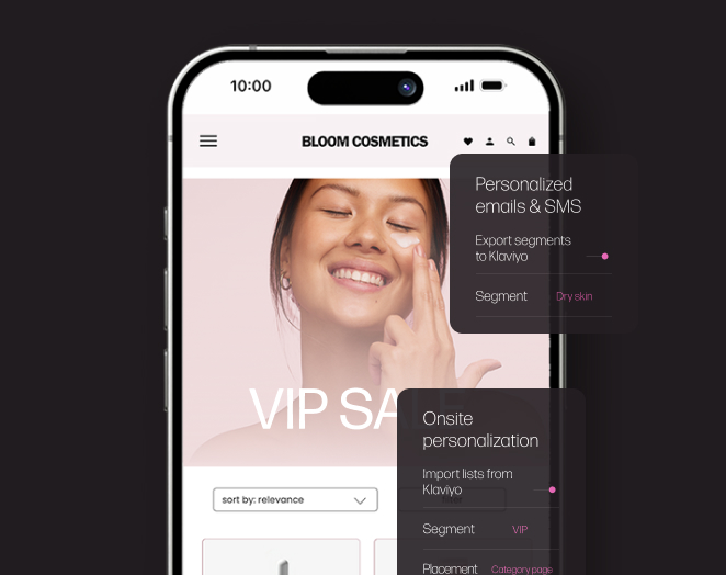
March 19, 2024 5 Minute Read What’s new in Nosto: Enhanced Klaviyo integration for hyper-personalized shopping experiences across channels Read more
March 18, 2024 3 Minute Read Nosto launches new Klaviyo integration to help online retailers scale hyper-personalized, cross-channel shopping experiences Read more
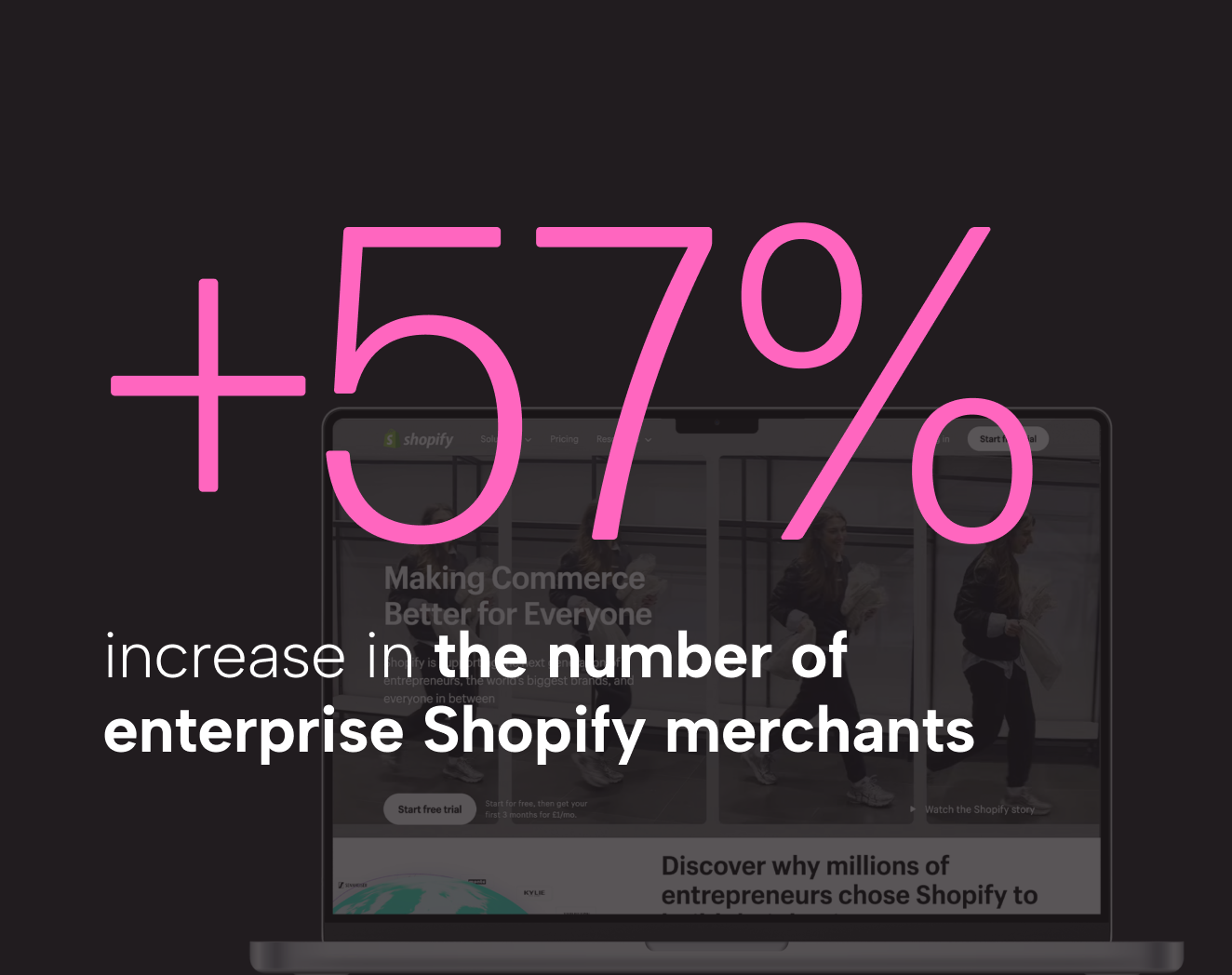
March 15, 2024 4 Minute Read Nosto reports +57% increase in the number of enterprise Shopify merchants using its platform for search, merchandising, and personalization over the last 12 months Read more
March 7, 2024 4 Minute Read Nosto and VTEX launch Commerce Experience app, powering intelligent, personalized product discovery for online brands Read more
January 18, 2024 4 Minute Read Nosto and Tapcart launch new integration, helping Shopify brands boost mobile sales with personalized shopping experiences Read more
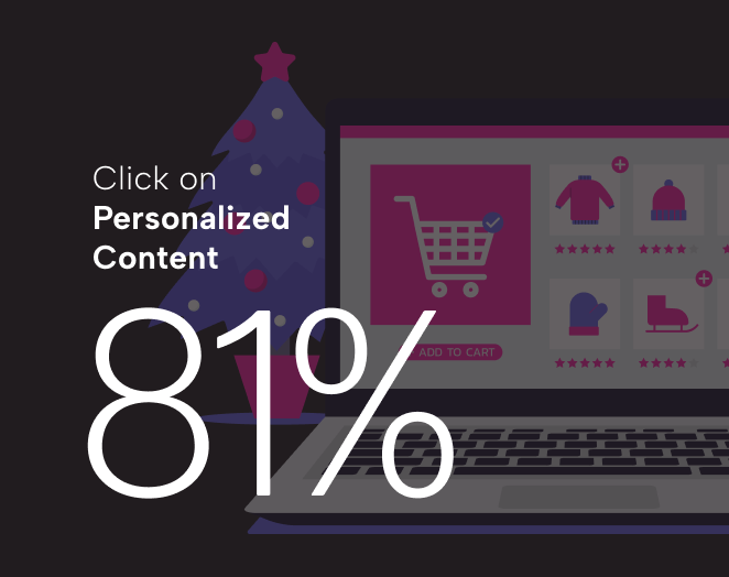
December 12, 2023 3 Minute Read New research: Festive Shoppers 5x as Likely to Click on Retailers’ Product Recommendations and 81% More Likely to Click on Personalized Content This Year Read more
March 19, 2024 5 Minute Read What’s new in Nosto: Enhanced Klaviyo integration for hyper-personalized shopping experiences across channels Read more
November 2, 2023 3 Minute Read What’s new in Nosto: Enabling Shopify brands to shorten the path to purchase with add-to-cart for Visual UGC Read more
October 12, 2023 4 Minute Read What’s New in Nosto: Unlocking UGC production metrics with the Content Dashboard Read more
October 5, 2023 5 Minute Read What’s New in Nosto: Merchandising rules for Product Recommendations Read more
September 14, 2023 5 Minute Read Nosto announces full end-to-end integration with Shopify Markets, giving commerce brands complete control and flexibility over multi-market personalization Read more
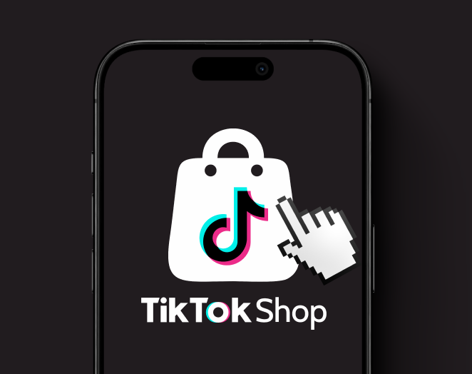
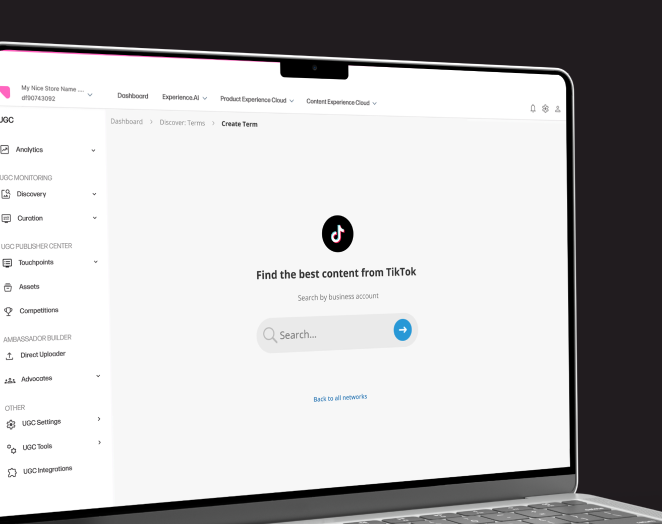
July 20, 2023 3 Minute Read What’s new in Nosto: Easily leverage your TikTok brand content across the customer lifecycle journey Read more
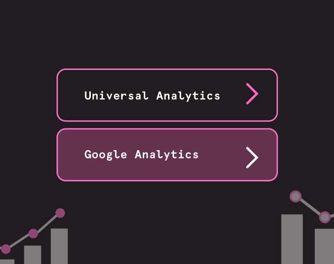
July 5, 2023 5 Minute Read What’s new in Nosto: Google Analytics 4 plugin available for Visual UGC Read more
March 18, 2024 3 Minute Read Nosto launches new Klaviyo integration to help online retailers scale hyper-personalized, cross-channel shopping experiences Read more
March 15, 2024 4 Minute Read Nosto reports +57% increase in the number of enterprise Shopify merchants using its platform for search, merchandising, and personalization over the last 12 months Read more
March 7, 2024 4 Minute Read Nosto and VTEX launch Commerce Experience app, powering intelligent, personalized product discovery for online brands Read more
January 18, 2024 4 Minute Read Nosto and Tapcart launch new integration, helping Shopify brands boost mobile sales with personalized shopping experiences Read more
December 12, 2023 3 Minute Read New research: Festive Shoppers 5x as Likely to Click on Retailers’ Product Recommendations and 81% More Likely to Click on Personalized Content This Year Read more
October 13, 2023 6 Minute Read Nosto and Shopware announce Platinum Partnership to help global brands win with intelligent ecommerce personalization Read more
October 10, 2023 5 Minute Read New research: 87% of Ecommerce Brands Prefer Using Images from Real Customers over Handpicked Models or Influencers for Showcasing Diversity Read more
December 19, 2023 7 Minute Read Insights from ‘The Women’s Domain & The Rise of Social Commerce’ Panel Read more
October 19, 2023 8 Minute Read A look-back at Nosto’s Ecommerce Expo session: talking ‘intelligent product discovery’ with clients, Dermalogica, and Casio Read more
March 26, 2024 2 Minute Read Introducing the Nosto Customer Community: Elevating our Clients’ Experience with us Read more
April 7, 2022 7 Minute Read Consumer Behavior Stats 2021: The Post-Pandemic Shift in Online Shopping Habit Read more
May 13, 2021 11 Minute Read 7 Best Practices to Sharing UGC on Your Brand’s Social Media Channels Read more