From strategic merchandising set-ups to effective A/B testing campaigns, get inspired to level-up your commerce experience game through this pool of real-life, Nosto-powered examples.
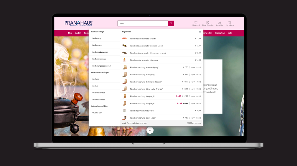
PranaHaus
PranaHaus Boosts Search CTR to 22% with Enhanced Autocomplete
placeholder
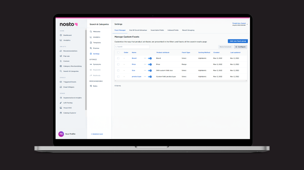
How unified filters boost product discovery across Search and Category pages
placeholder
Boosting product accuracy across search and category pages with Score Insights
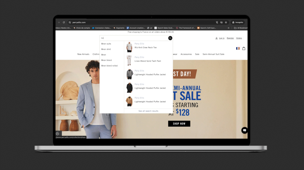
Perry Ellis
How Perry Ellis personalizes autocomplete to surface relevant products as intent evolves
placeholder
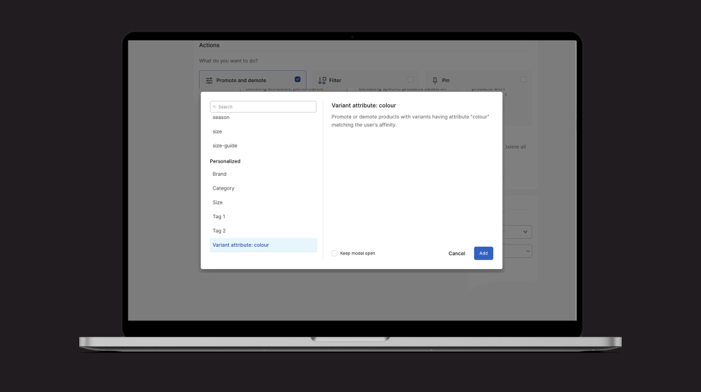
Boost relevance with personalized search rules based on each shopper’s color affinities
placeholder
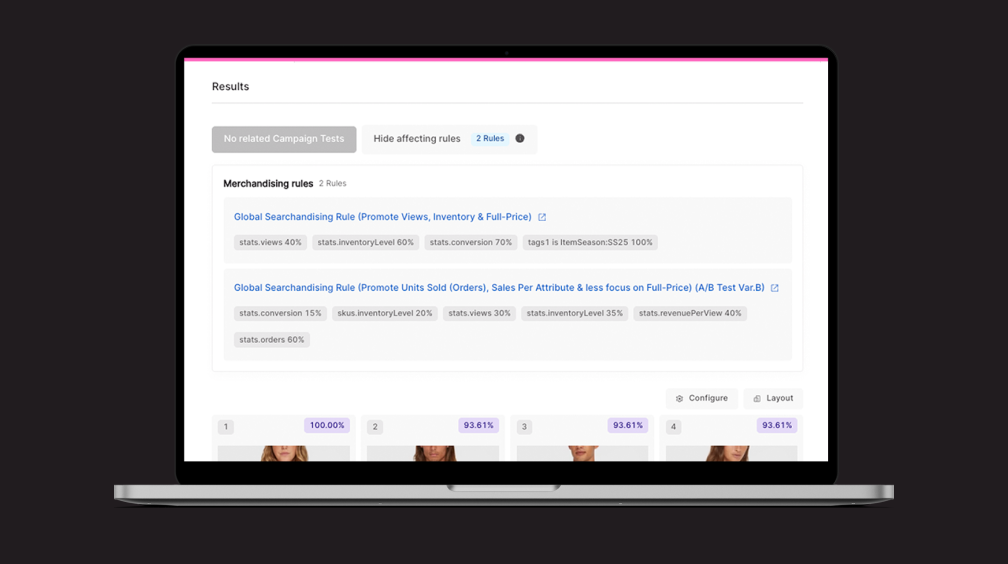
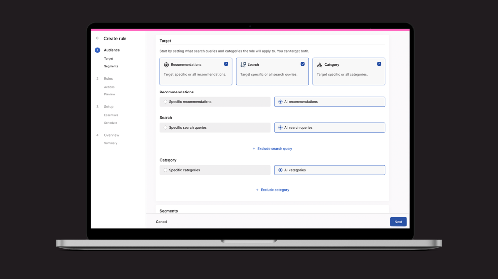
Drive KPI-aligned merchandising across Search, Category, and Recommendations—all from one UI